I've written a lot about UML, and every now and then I get questions like: "Does a modern, agile, dynamic analyst really need that UML of yours?" And it made me think that it would be useful to explain why I need diagrams in my work at all, and which ones specifically. Ideally in a simple, practice-focused way.
So let’s start with why an IT business analyst needs diagrams. Aside from helping others grasp information more easily, diagrams also offer personal benefits:
So let’s start with why an IT business analyst needs diagrams. Aside from helping others grasp information more easily, diagrams also offer personal benefits:
- Drawing is helpful even just for yourself. For instance, if you view a system's data as a model (with all the relationships clearly shown), you will: a) get a high-level picture much more easily, and b) likely spot gaps or mistakes. Compare that to trying to scan a block of structured text.
- Diagrams as checklists. Many notations have built-in rules that guide your thinking. For example, if you draw a process diagram with a branching point, you realize each branch needs at least two outcomes. If you only have one, something’s wrong.
Now, does an analyst really need modeling notations? Honestly, in most day-to-day work, they feel overkill. Unless you’re expected to be a hardcore UML purist, the benefits above can be achieved with intuitive sketches. Yes, it’s true that notations increase the chances of your diagrams being correctly interpreted, but there are a few more nuances worth noting:
- Learning notations improves freestyle. A person who’s seriously studied standard modeling approaches will draw clearer, more complete, and more accurate diagrams. And since even small errors or miscommunications in requirements can cause major issues, this skill matters. The real benefit of studying UML, BPMN, IDEF, DFD, etc. isn’t so much the rules themselves as it is learning how to model.
- You avoid reinventing broken wheels. Over time, you build a toolkit of perspectives: use cases, architecture, algorithms, environments, data structures, flows, states, etc. This helps you choose the most effective lens for each problem. And you don’t have to invent tools from scratch every time. Once you grasp this mindset, you can forget about UML purity. Your diagrams become even more useful, because you know how to "cook" them properly before improvising.
Here’s what’s stuck in my practice and why. I've tried most popular notations, but only a few earned a place in my heart. Let me walk you through the ones I like best, how and when I use them.
UML (Unified Modeling Language)
UML is a language for drawing things related to software (in smarter words: https://shesterov.by/homeen/tpost/9fvno0z8z1-uml-and-the-it-analyst). UML includes many diagram types, most of them aimed at developers. But a few are gold for analysts dealing with requirements.
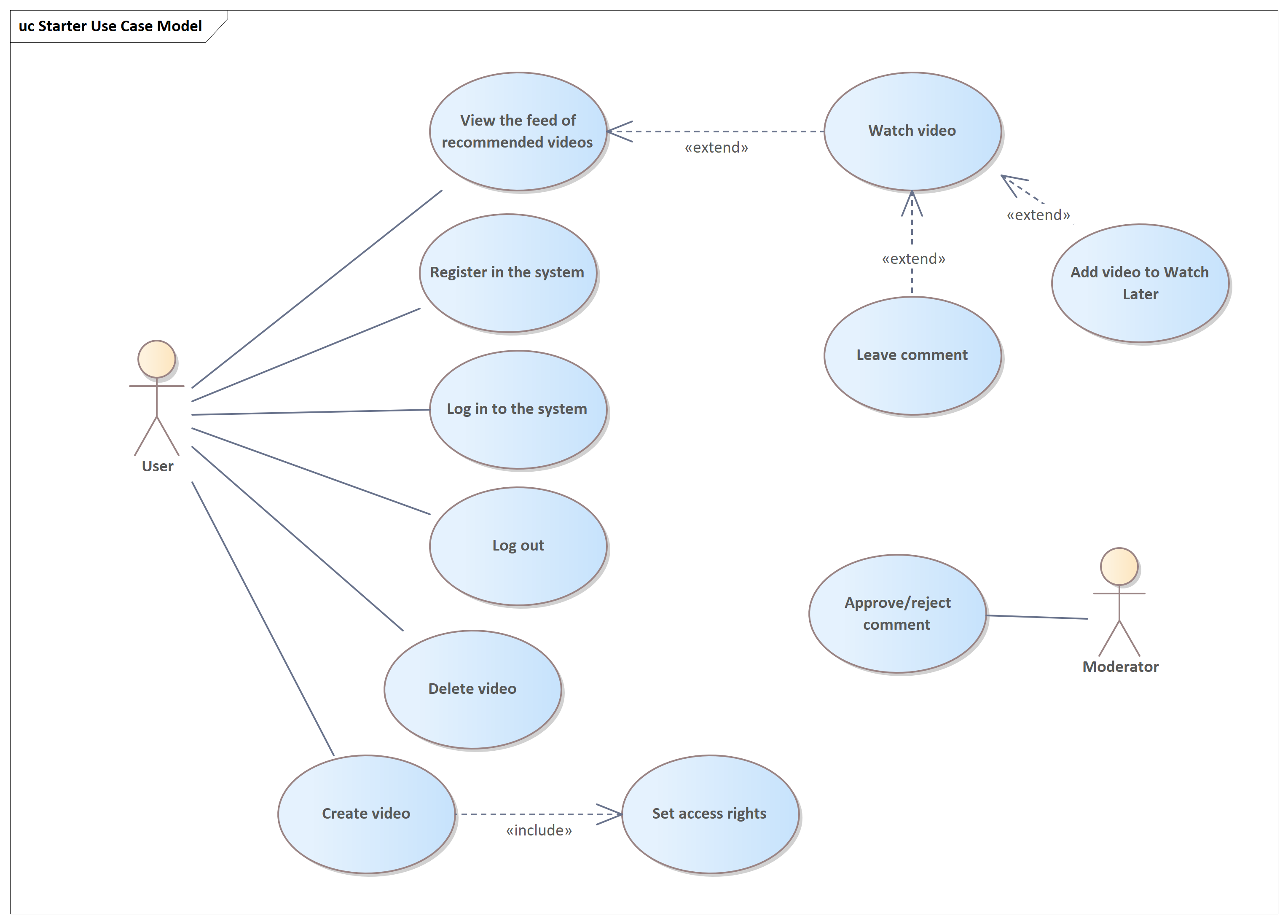
Use Case Diagram — the most analytical of diagrams. Once, "Use Case" was synonymous with IT analysis. Now we have User Stories, but Use Cases still work great when:
They're fast and easy to draw. The benefits still hold. Compared to User Story Maps, which focus on development priorities and detailed steps, Use Case Diagrams highlight the big wins for users. Maybe I’m old-school, but I still find them incredibly helpful.
UML is a language for drawing things related to software (in smarter words: https://shesterov.by/homeen/tpost/9fvno0z8z1-uml-and-the-it-analyst). UML includes many diagram types, most of them aimed at developers. But a few are gold for analysts dealing with requirements.
Use Case Diagram — the most analytical of diagrams. Once, "Use Case" was synonymous with IT analysis. Now we have User Stories, but Use Cases still work great when:
- You want to quickly visualize what the system does for users and external agents.
- You need to show this to stakeholders.
- You document requirements via Use Cases and want a big-picture view.
They're fast and easy to draw. The benefits still hold. Compared to User Story Maps, which focus on development priorities and detailed steps, Use Case Diagrams highlight the big wins for users. Maybe I’m old-school, but I still find them incredibly helpful.
Class Diagram — great for any structural modeling. Department hierarchy? Glossary? Sure. While not always the best fit (I prefer mind maps for many structures), Class Diagrams shine when modeling domain structures: key concepts and relationships in the problem space (see: https://shesterov.by/homeen/tpost/tlf8tf9h61-ba-techniques-explained-business-domain).
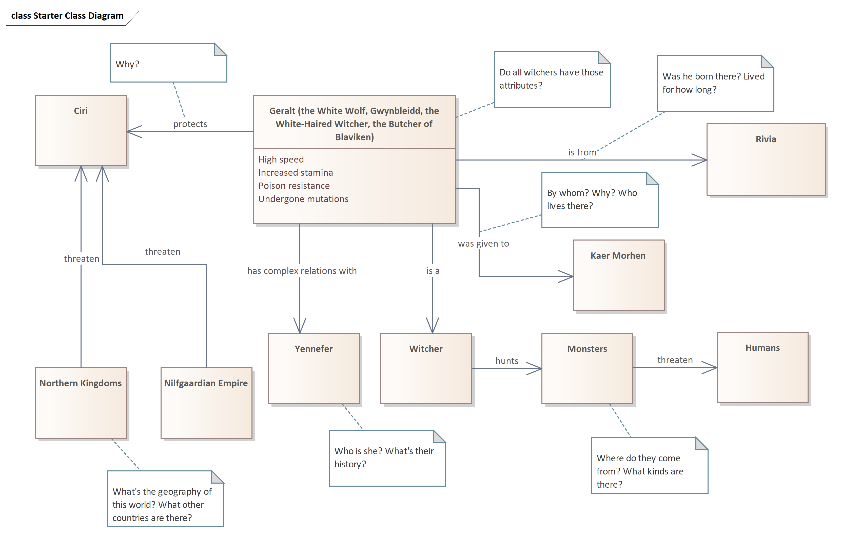
I used UML Class Diagrams for a long time — and quite successfully, I’d say — but I’ll admit that over time, mind maps started to push them out of that role. As a tree-like structure, especially when built in a tool with hotkey-based editing, mind maps are absolute fire. They’re quick, intuitive, and brutally efficient.
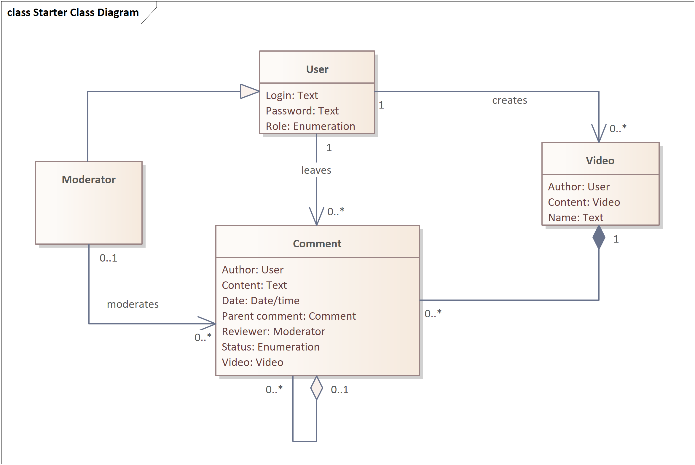
That said, one area where Class Diagrams still shine is data modeling. They're not the only notation that works for this, but personally, I like them best. Since we’re talking about requirements, these aren’t database schemas — we’re dealing with logical data models or similar layers of abstraction that stop well short of physical implementation. More on that here: https://shesterov.by/homeen/tpost/4067s3mrf1-uml-class-diagram
That said, one area where Class Diagrams still shine is data modeling. They're not the only notation that works for this, but personally, I like them best. Since we’re talking about requirements, these aren’t database schemas — we’re dealing with logical data models or similar layers of abstraction that stop well short of physical implementation. More on that here: https://shesterov.by/homeen/tpost/4067s3mrf1-uml-class-diagram
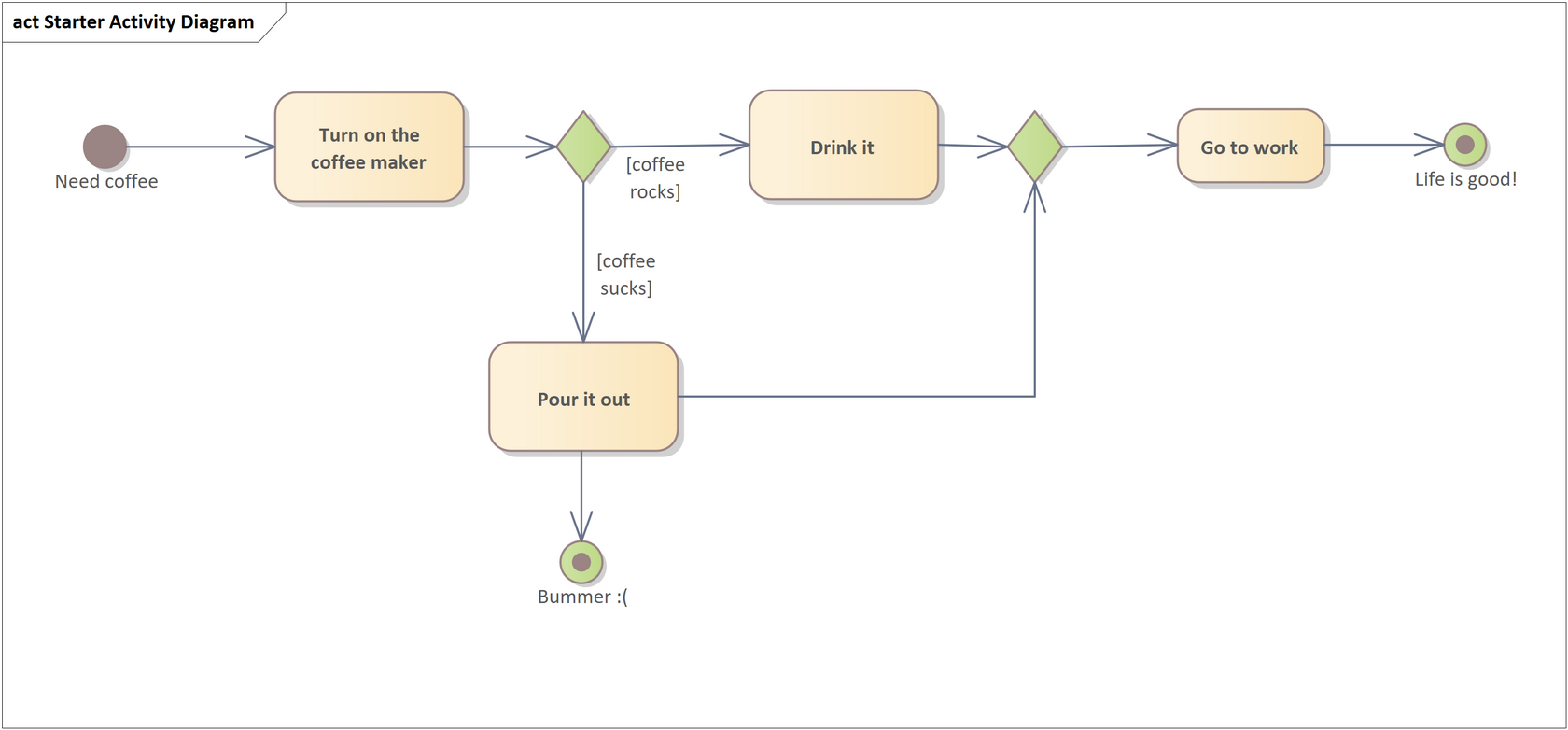
Activity Diagram. Where once flowcharts ruled the land, the Activity Diagram has taken over. It’s a more powerful, more flexible beast. This is my go-to diagram for visualizing complex processes — steps, branches, loops, and other algorithmic fun. When a process gets hairy, this is where I turn. More here: https://shesterov.by/homeen/tpost/mver50enp1-uml-activity-diagram
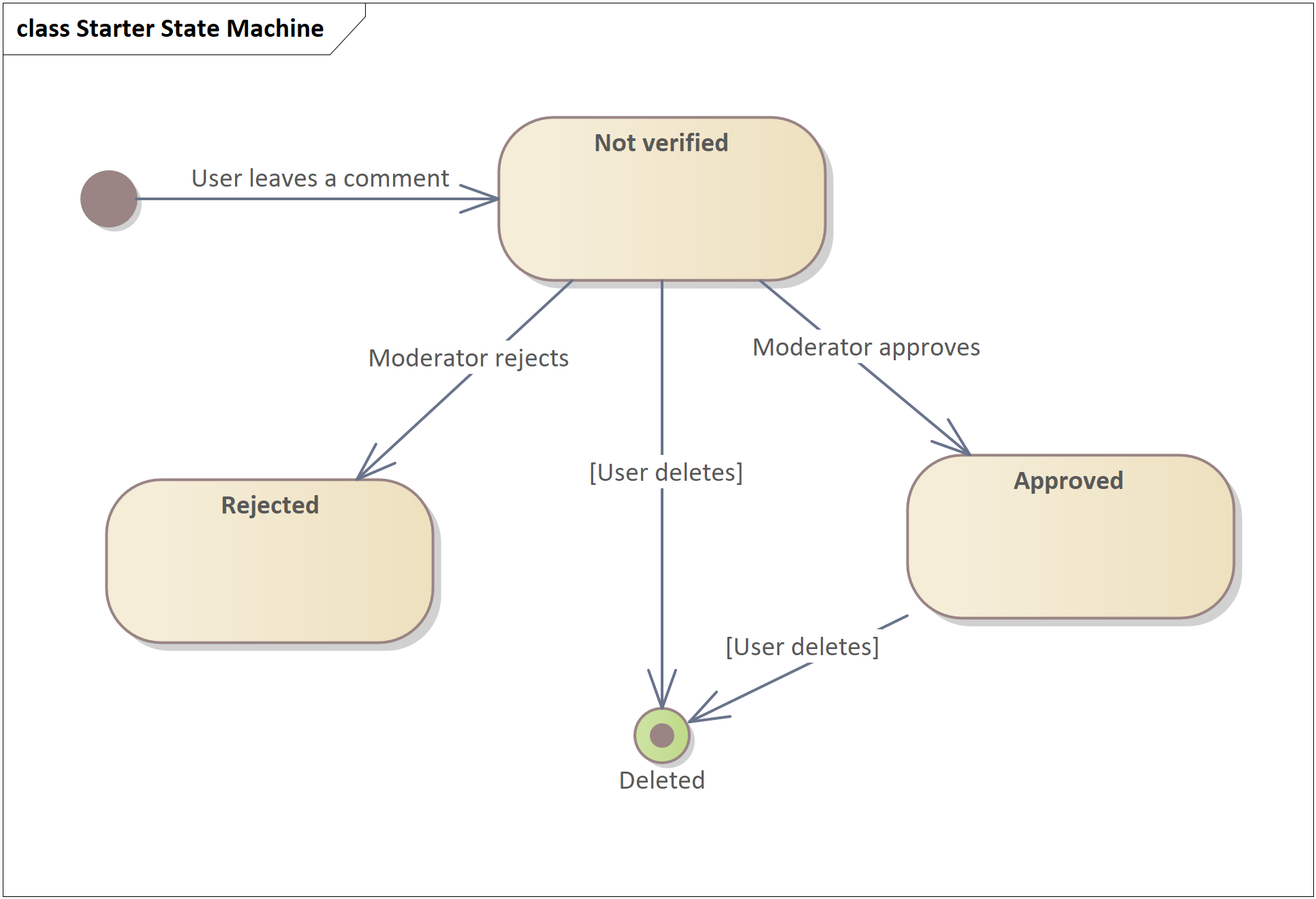
State Machine Diagram. It shows how something transitions between different states over its lifetime. It’s similar to an Activity Diagram but shifts focus: instead of highlighting steps in a process, it zeroes in on how an object behaves and changes over time.
I don’t use these often — not because they’re useless, but because the need to model state transitions doesn’t come up every day. But when it does, this diagram is absolutely killer. It gives you a new lens to look at the modeled object — and often uncovers a ridiculous number of gaps in both the requirements and your own understanding. More here: https://shesterov.by/homeen/tpost/upydulblp1-uml-state-machine-diagram
I don’t use these often — not because they’re useless, but because the need to model state transitions doesn’t come up every day. But when it does, this diagram is absolutely killer. It gives you a new lens to look at the modeled object — and often uncovers a ridiculous number of gaps in both the requirements and your own understanding. More here: https://shesterov.by/homeen/tpost/upydulblp1-uml-state-machine-diagram
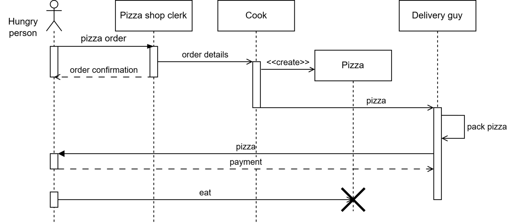
Sequence Diagram. This one focuses on participants and how they exchange messages, not on algorithmic flow. Personally, I’m not a big fan of using it for every little thing (like some analysts seem to be), but it’s in my toolkit nonetheless.
To me, it’s still a kind of process diagram — just one that emphasizes the “who’s talking to whom” side of things. In my flavor of business analysis, that angle is needed less often than algorithm-focused modeling. But when you do need that emphasis, Sequence Diagrams are great. More here: https://shesterov.by/homeen/tpost/lhxj61n9d1-uml-sequence-diagram
To me, it’s still a kind of process diagram — just one that emphasizes the “who’s talking to whom” side of things. In my flavor of business analysis, that angle is needed less often than algorithm-focused modeling. But when you do need that emphasis, Sequence Diagrams are great. More here: https://shesterov.by/homeen/tpost/lhxj61n9d1-uml-sequence-diagram
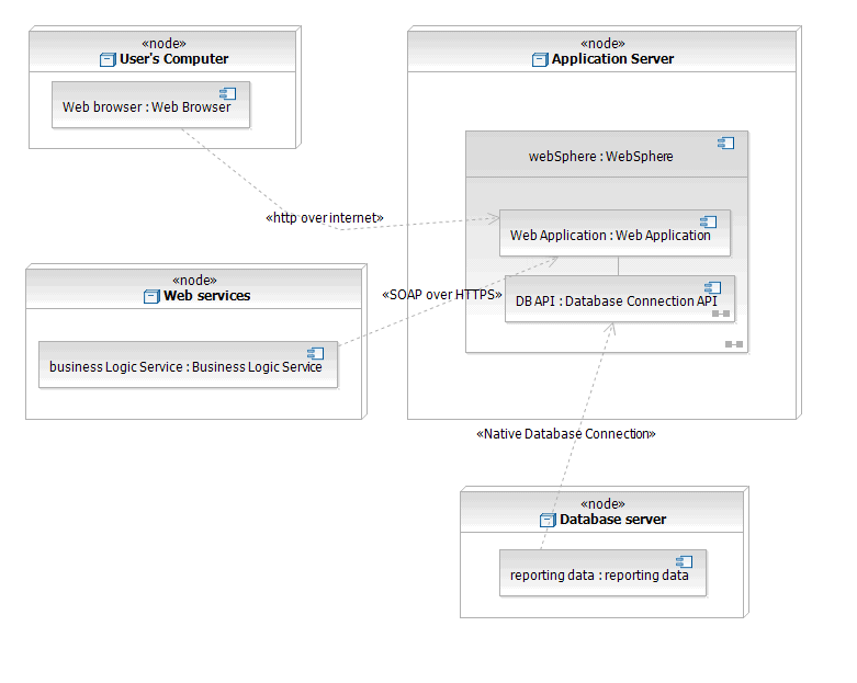
Honorable Mention: Deployment Diagram. Rarely needed, but occasionally useful for showing how software maps onto hardware.
DFD (Data Flow Diagrams)
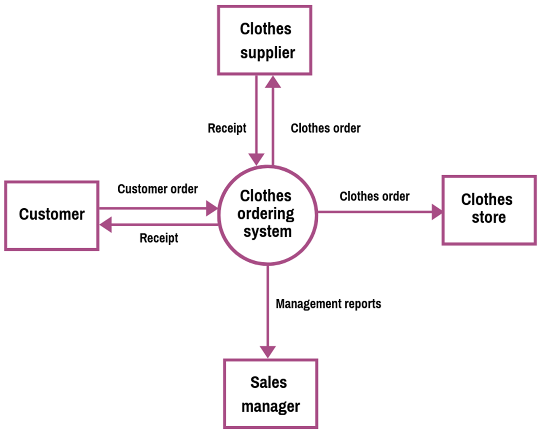
The Context Diagram (aka DFD Level 0) is foundational. I almost always start thinking through a solution by drawing one.
For those not raised on Karl Wiegers' books: a context diagram shows the boundaries of your system (but not what’s inside — it’s a black box for now), the external agents (people, hardware, software) interacting with it, and the information exchanged. It’s incredibly useful for:
- Defining solution boundaries (a common stumbling block for junior analysts).
- Identifying all external actors connected to your system.
- Serving as a launch point for future data modeling — the data flows in/out become seeds for a proper data model.
I use lower-level DFDs less frequently, but they’re still handy if you need to crack open that black box and show data flows inside the system.
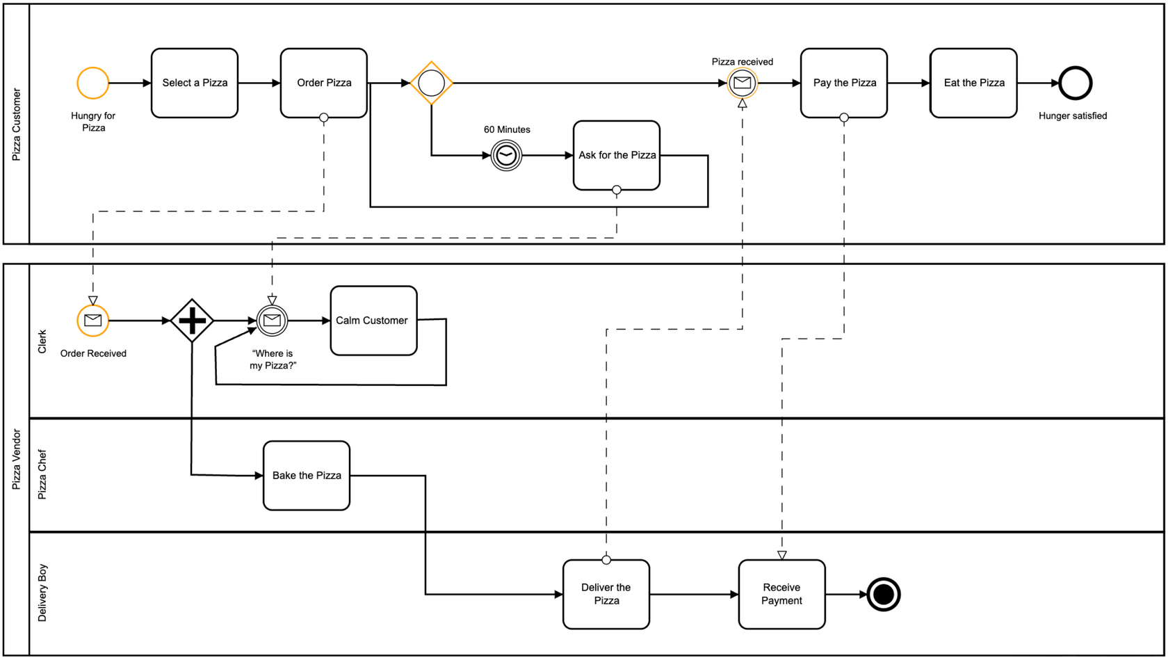
BPMN (Business Process Model and Notation)
This one’s for modeling real-world processes — business processes, to be exact. It’s not meant for visualizing software logic (at least not originally).
There are four types of BPMN diagrams, but in practice, everyone uses just two: Process Diagrams and Collaboration Diagrams — they’re similar enough that folks just say “BPMN diagram” and don’t sweat the subtype. The other two are so niche they’re not worth mentioning.
Personally, I don’t love BPMN for the kind of IT analysis I do. I get why it’s valuable for analysts who are deep in business process modeling, but that’s usually the exception in IT analysis, not the rule. Sure, BPMN can show things (steps, events, branches, participants) more richly than UML Activity, but honestly? That richness often turns into overkill. Most analysts go for simpler diagrams (flowcharts, UML Activity), not more powerful ones. And since BPMN is harder to draw and slower to read, it sometimes lands poorly with stakeholders. I’ll use it to flex a little in front of stakeholders or when the project specifically requires it — but otherwise, I skip it. Still, it's good to know BPMN exists and offers a more powerful way to visualize processes when needed.
IDEF (Integration Definition)
Also a modeling notation for IT systems. Outdated, frankly — UML has replaced it in almost all use cases. Some universities still teach it, and allegedly the U.S. Department of Defense is a fan. But in practice, I see little reason to become a disciple.
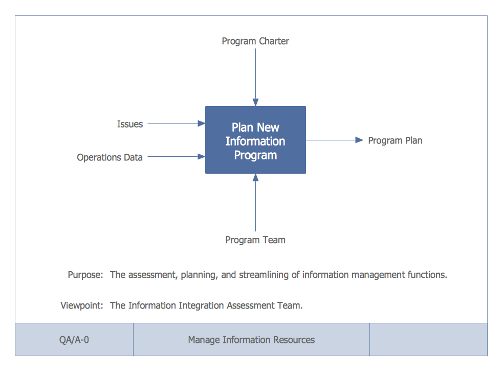
That said, IDEF0 is worth mentioning. It models functions, processes, or tasks — basically anything that takes inputs and transforms them into outputs. And it gives a cool perspective that’s occasionally useful on a whiteboard.
An IDEF0 context diagram (not to be confused with a DFD context diagram) views a function as a black box with four ports:
This lens is surprisingly insightful and quick to sketch — often highlighting stuff you might otherwise overlook.
Also a modeling notation for IT systems. Outdated, frankly — UML has replaced it in almost all use cases. Some universities still teach it, and allegedly the U.S. Department of Defense is a fan. But in practice, I see little reason to become a disciple.
That said, IDEF0 is worth mentioning. It models functions, processes, or tasks — basically anything that takes inputs and transforms them into outputs. And it gives a cool perspective that’s occasionally useful on a whiteboard.
An IDEF0 context diagram (not to be confused with a DFD context diagram) views a function as a black box with four ports:
- Inputs (what’s processed),
- Outputs (results),
- Controls (what governs how it works),
- Mechanisms (what executes it).
This lens is surprisingly insightful and quick to sketch — often highlighting stuff you might otherwise overlook.
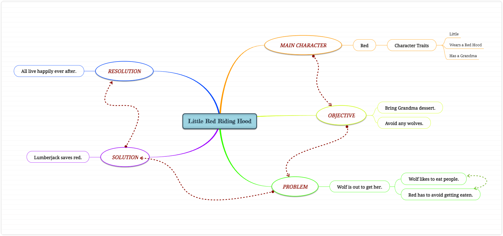
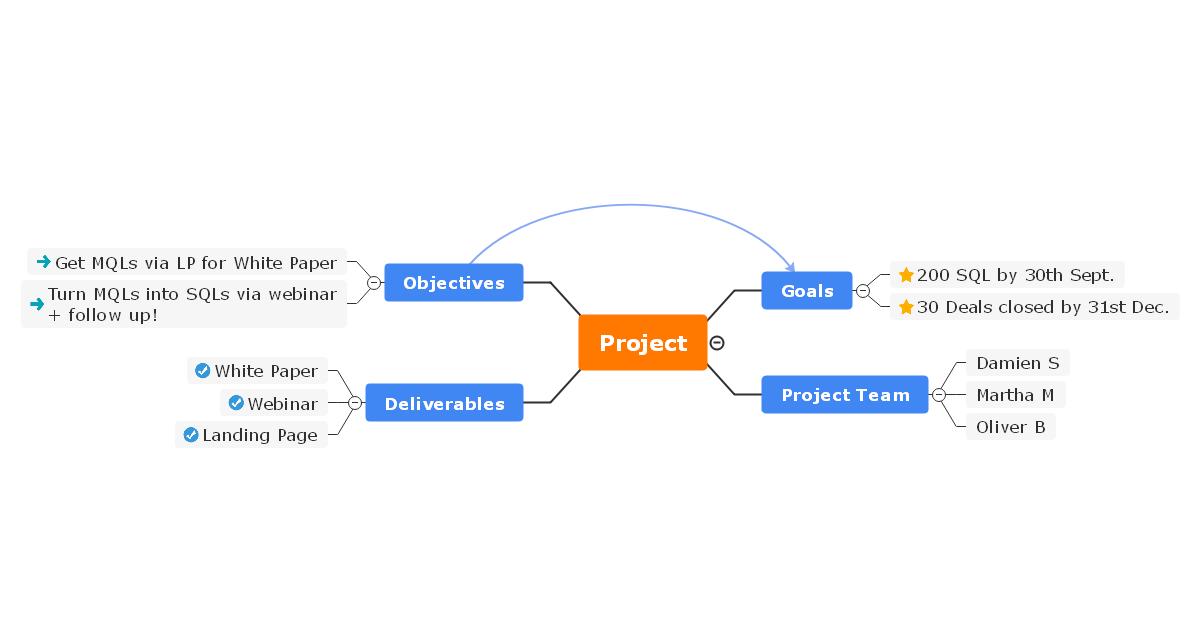
Mind Maps
Pure fire. One of my favorite tools for visual thinking. So much so that I use dedicated software for it — because drawing diagrams usually means slow mouse-dragging, while a good mind-mapping tool is all hotkeys and blazing speed.
What I use them for:
Basically, anything that fits into a tree-like structure and benefits from quick, visual layout.
Pure fire. One of my favorite tools for visual thinking. So much so that I use dedicated software for it — because drawing diagrams usually means slow mouse-dragging, while a good mind-mapping tool is all hotkeys and blazing speed.
What I use them for:
- Project planning (personal and work-related),
- Checklists of all kinds,
- Notes and summaries,
- Knowledge bases...
Basically, anything that fits into a tree-like structure and benefits from quick, visual layout.
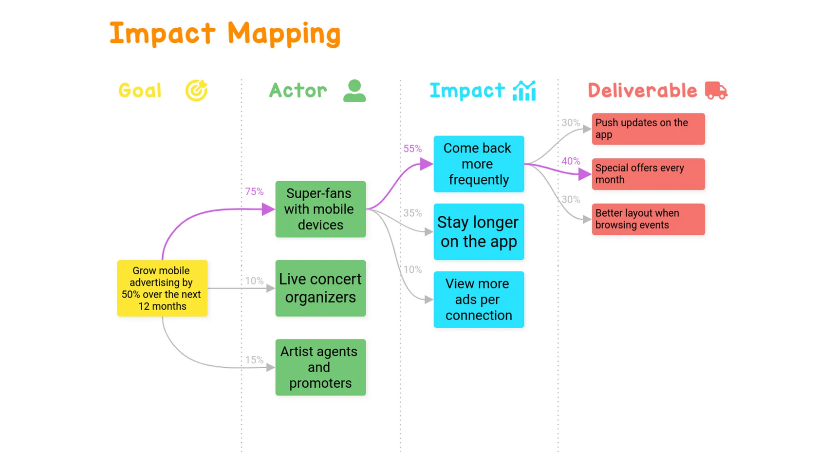
Fun fact: one specific analys technique actually grew out of mind mapping — Impact Mapping. More here: https://shesterov.by/homeen/tpost/m77p1kae81-impact-map-and-user-story-map-how-to-tac
So, what do I draw? Imagine this: I’ve got a whiteboard and someone standing nearby. I need to pour some non-trivial knowledge into their head, fast. That means I’ll be talking and sketching.
Here’s what I reach for:
Naturally, in this kind of quickfire setting, the diagrams won’t be UML-perfect. Arrows might point wherever, and no one will care. What matters is clarity, not formalism.
Bottom line: these diagrams — when used wisely — cover almost every situation an analyst will face when working with requirements and communicating them to the team or stakeholders. Just take a moment to ask yourself: Will the person reading this actually get it? If not, either simplify or teach. Either way, it’s a win.
Here’s what I reach for:
- If it’s a process: UML Activity Diagram (if the focus is on the algorithm), or UML Sequence Diagram (if it’s about participants and message flows).
- If it’s structure: Mind Map (if tree format works), or UML Class Diagram (if I need boxes and relationships).
- If it’s something else: one of the other diagrams mentioned above, or I’ll freestyle something custom.
Naturally, in this kind of quickfire setting, the diagrams won’t be UML-perfect. Arrows might point wherever, and no one will care. What matters is clarity, not formalism.
Bottom line: these diagrams — when used wisely — cover almost every situation an analyst will face when working with requirements and communicating them to the team or stakeholders. Just take a moment to ask yourself: Will the person reading this actually get it? If not, either simplify or teach. Either way, it’s a win.
